It’s that time of the year again! I’m going back to school tomorrow, and that marks the end of my summer. I’m feeling a little tired, to be honest. This summer, I had the least amount of rest I’ve ever had, and done the most work. More specifically, I worked as a software developer at AudioNotch. I’ll break down what I did, and what I learned.
What is AudioNotch?
Want to check out what I did? You can find the website at https://audionotch.com, and try out the iOS App or the Android App. Everyting’s free to look at, though you need a paid account to do step 2/3.
Briefly, let me explain to you what AudioNotch is. Essentially, it’s a consumer SaaS that provides notched music for tinnitus sufferers.
Some of those words might be confusing. SaaS is an acronym for software as a service: we sell software. Tinnitus is a condition that creates a loud, high-pitched ringing noise in someone’s ears following some sort of injury or damage to the ears/brain. While it’s not exactly clear as to what causes tinnitus, many believe that it’s the brain compensating for lack of sensory input. Unfortunately, there is no current catch-all cure.
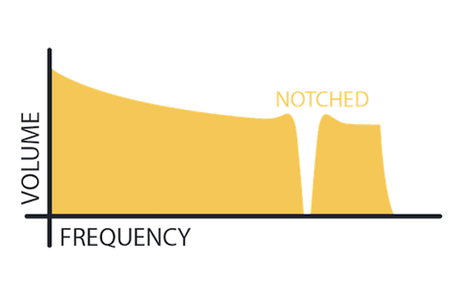
Notched sound therapy takes the frequency that the tinnitus pitch is at and removes it from the frequency spectrum of a song, or “notching” it. It tricks the brain into removing the stimulus entirely. While it’s not clear if notched sound therapy works for everybody, it works for some people.
When I joined AudioNotch, it was in what the founder called “maintenance mode”. No new features were being added, no visual updates, just fixing bugs and doing customer support. Unfortunately, their business had been tapering off a bit, in no part to its rather archaic website and the rise of free competitors. So, they brought me in to make a mobile app, and at the end, I was also able to update the look of the website.
Mobile Development
Note: this section is more “here’s what I did” and less “here’s why I did it” since I’m a mobile app dev noob. The website redesign section has more analysis, since that’s more my domain.
The biggest undertaking I had to do was making a mobile app. Essentially, I had to make an iOS + Android app that replicated the functionality of the web app, while keeping the native feel.
Right off the bat, I wanted to make the app with Ionic. Ionic is basically a themed Angular abstraction layer over Cordova, which is a cross-platform app solution that works by running a browser on the phone and then making custom plugins to interact with native device features.
Wow, that was a mouthful. I think choosing Ionic was the right choice, especially with the timeframe that I had and the lack of experience I had with Swift/Android. I’ll talk about some of the limitations I ran into with it later, but overall it ended up working well for me.
The core functionalities I had to implement were:
- Account login/logout system that works with the web app’s login/logout system
- A tuner that replicated the Web App’s Tuner
- The ability to create and play back notched music, similar to Step 2/3 on the Web App
I’ll talk about how I did all three of these things, as well as some lessons I learned about app dev in general.
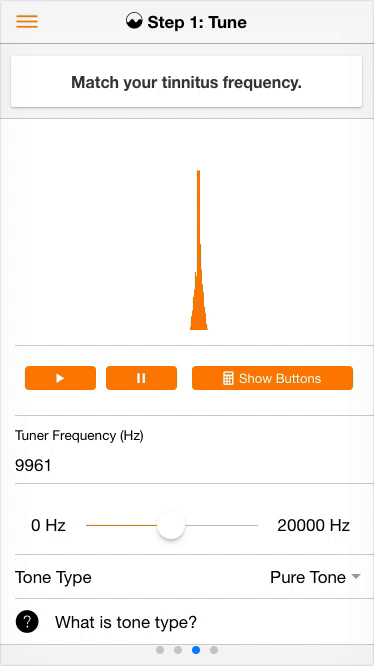
Step 1: The Tuner
This was actually the first thing that I implemented code-wise, as it was one of the selling points of our product, especially on the mobile market. We also planned to make it free, as a leader into our paid service (notching). Basically, I had to make a page in our app that emitted a sound, with the user being able to change the frequency of the sound and apply filters to it.
The first thing I did was look into the Javascript Web Audio API, with help from one of my bosses. Essentially, the Web Audio API lets you create and manipulate sounds, similar to audio manipulation libraries found in other programming languages. Unfortunately, the Web AudioAPI is still pretty new, and not all browsers support it. In addition, the documentation for it is sketchy at best, and some of the features don’t work as intended.
I built the system with reference to the web version: since both the web version and the mobile version were made in Javascript, I could look to the web version for some help! Still, I had to convert everything to Typescript and clean up some of the code, plus fix quite a few bugs.
The spec of what I made was basically this:
- Tuner creates tone, generated by API
- User can control frequency of the tone
- User can control volume of the tone
- User can apply filters to the tone (tone types)
- User can see visualisation of frequency
First thing I did was make some sort of tone appear. You can do this pretty easily with the Web Audio API’s OscillatorNode, which creates an oscillator that vibrates at a certain frequency; adding a slider that modifies that oscillator’s frequency value is quite trivial. I hooked the OscillatorNode through a GainNode, that let me control the volume of the tone, and subsequently letting the user control it as well.
Adding the filters and the visualisations was a bit tougher. The default, unfiltered sound is just a pure tone, but I needed to add filters like “BB Noise”, “Square Wave”, or “Sawtooth”. Luckily, the previous codebase from the web app helped. I implemented two different kinds of filters: tone filters, and noise filters. Tone filters changed the actual wave of the tone produced: changing these is as easy as changing a property on the oscillator, through OscillatorNode.type. Creating the noise filters was a bit harder. Instead of using the tone generated from the oscillator, I randomly generated white noise, and then applied a BiquadFilterNode (or a chain of them) creating a specific effect. The kind of filter I applied is called a bandpass filter: it only allows noise from a specific frequency through, and blocks out everything else. Due to the Web Audio API’s newness, I didn’t end up using the built-in bandpass, but rather running a lowpass and a highpass filter in parallel.
The visualisations were created by hooking an AnalyserNode into the sound loop, and sampling the volume of the sound at each frequency interval, and then drawing a bar corresponding to the volume on an HTML5 Canvas. It’s actually easier than it sounds.
The foundations of what I was doing is called Digital Signal Processing. It’s quite a complex field, and ultimately I don’t fully understand what I was doing. That being said, I did learn a bit about the field, and it’s definitely interesting! One of my bosses was able to give me a quick run down, which was super nice of him, but it’s a complex field that I’m excited to learn more about!
The nice thing about using Ionic in this situation was that I didn’t have to implement the same feature in two different languages/platforms. While Java and Swift both have audio manipulation libraries, implementing every little feature in both languages would be a pain, especially if the implementation of each section of the tuner would require slightly different code.
Here’s a gif of the tuner in action (though you can’t hear the sound, unfortunately):
Step 2: Create/Listen
The next thing I had to do was allow the user to create/listen to their notched music. This is kinda awkward, since we don’t handle user auth yet, but since I was waiting on making changes to the web app I had to do this first. I ended up just creating a fake user/auth loop that always returned a test user’s credentials, and then moved forward.
This was the hardest step of the entire operation. My original plan was to have the creation happen completely on the device, which would mean that I had to implement the filter locally. The notching step is basically a bandstop filter, where everything except a frequency band is let through. Unfortunately, there were quite a few obstacles in the way. The very first thing was that the default bandstop filter in the Web Audio API didn’t fit what we needed to do: not only was it not powerful enough, it wasn’t easily customizable. So, I tried making a bandstop filter by adding a lowpass and a highpass (exactly what they sound like) together. Unfortunately, they still weren’t strong enough, even when creating 10 in a row and chaining them together. How many filters are chained together is called the “order” of the filter, and upon consulting my boss on the web app, I needed an order of about 1500. Programmatically generating that in Javascript, on a mobile phone nonetheless, would be near impossible (given computational constraints). I tried using some Javascript sound manipulation libraries such as fili.js, but unfortunately it still didn’t work out.
Eventually, I figured out a different solution: send a POST request to the web app, which would do the grunt work of the audio processing, and then download the songs to the device. Seems quite simple, but I never really thought about it. Now, I bypass a lot of problems: since the computation is done on the server, I no longer have issues with mobile limitations. I also don’t have to figure out the I/O for each of the mobile OS, as well as implementing a custom cordova plugin (which was my next idea).
There are a few problems with this solution: you need to be online, you don’t have an idea of when the song is done processing (the web app endpoint wasn’t that complex), users can’t upload custom audio, and users can feel frustrated if they don’t understand the system properly. Ultimately though, we were pushing an MVP, and this was the best solution.
So, I implemented an API endpoint for the AudioNotch Web App, which basically allowed me to send an auth request with operations (e.g. create a song, etc.). It ended up working out mostly fine, and that got me over the largest hump of the app development.
Listening was also pretty easy once I ditched the Web Audio API; originally, I tried loading in the data using AudioContext.decodeAudioData() from the Web Audio API, but the function is literally broken so I had to drop that idea as well. At the end, I used an Ionic Native plugin (a wrapper for cordova plugins, which allow you to access native mobile OS functionality) to load the files from the device’s local storage and play them. That was pretty simple, even though the documentation for the Ionic Native plugin is virtually non-existent.
I think ultimately, what I learned here was that I needed to look at the bigger picture quicker. I was too fixated on notching the music on the phone to realise that a working phone app was more important than a non-existent one, and that users couldn’t really tell the difference from their phone notching the sound and having to wait a few seconds versus the server notching the sound and having to wait a few seconds. While this final solution ended up disappointing me a bit, I’m not making this app for me. I’m making it for the people using this app, and I needed to think more about what they wanted: a working app that let them listen to their notched music library, not one that used some sort of ninja secret library to notch files locally on the phone. Notching is a one-time process, but listening is one that happens all the time (and is the more likely use case for the phone). At the end of it all, we received zero complaints on the inability to notch music offline. Go figure.
Step 3: User/Auth
Now, it didn’t make sense to make user/auth work last, but that’s what I had to end up doing due to organisational problems. It was pretty simple: send a POST request to the server with the user/pass, and see if they were valid; if so, change the app’s state to logged in. Things got complicated as I added different possible states though: what happens if the user is offline, or hasn’t paid for an account yet? After some very confusing if-statements and promise chains, I figured out a system that I can’t disclose here to figure everything out. Kinda.
Surprise! IAPs!
While we were trying to publish the app, we also found out that with Apple’s strict guidelines on app purchase guidelines we couldn’t link to our web app’s purchase page, and we HAD to have the user purchase our paid product through the App Store’s In App Purchase method. I ended up using another Ionic Native plugin aptly named InAppPurchase, but the documentation was absolutely awful: it took me a few days to get something that should’ve only taken a few hours to work properly. But, it worked. That’s what mattered.
Publishing
After a month, I had finally completed the mobile app. I went through the mess that was Ionic documentation and made a complete app, even if it did have quite a few bugs. We were ready to publish.
Publishing in the Google Play Store was actually super simple: all I had to do was sign the .apk file, pay for the account, answer a few questions, and voila! We were good to go! Our app was published on the day that I pressed the deploy button.
Unfortunately, the App Store wasn’t the same. First, we had to fill out an insane amount of regulatory forms. Tax stuff, proving we’re a business, etc. Secondly, the amount of review that we had to go through was insane! Each update had to be human-checked, and minor trip-ups required an entire submittal process. And the submittal process took a long time: I couldn’t sign a version from the command line, but rather go through some long process in Xcode and fix my provisioning profiles (also pretty tough).
But, hey, it worked out. The app is on the iOS and Android appstores, and we’re making money. It all worked out, right?
I actually don’t know. Unlike the more wordier website section coming up, this is my first time making a market-ready app. I’m not that skilled in app UI/UX (though I’m working on it), so I don’t know if I made the right decisions. We have only just started getting data on our app, so it’s hard for me to make good analysis. And unlike the website, I have no reference point to know if I did the right thing, or that people just wanted an app. Unfortunately, that means that this section was more me documenting what I did and less me giving advice/talking about why I did things.
There’s going to be a bit more about the app later, in another blog post. Stay tuned.
The Redesign
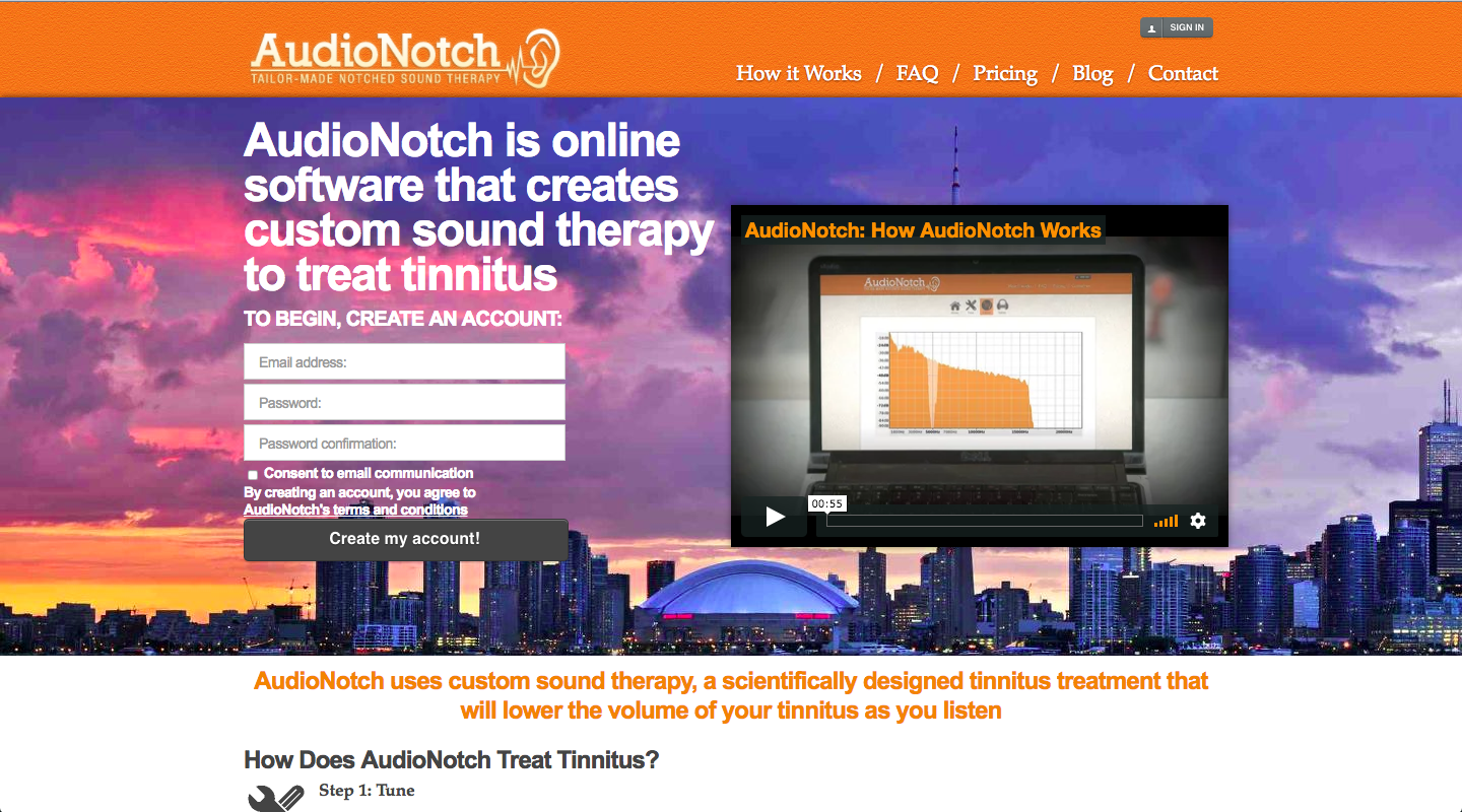
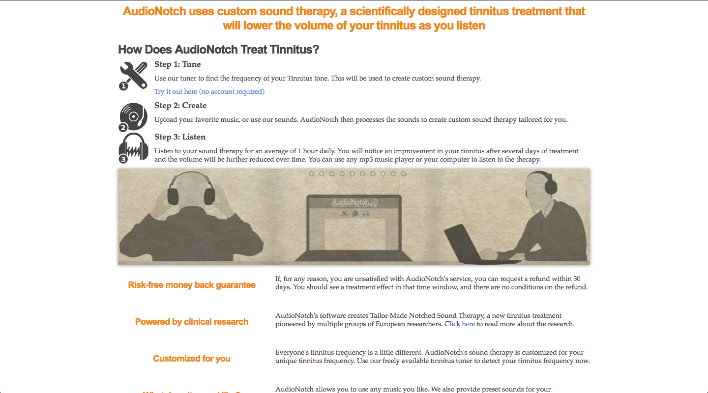
That website looks… a bit old. And that’s because it is. When AudioNotch was originally created (I think in 2012?) they made that website, and it wasn’t bad. But, as time passed, trends changed, and the website became antiquated and hard to use.
After finishing the app, I really thought that one of the most important things we needed to do was change the website. Since it’s the primary point of discovery for this business, it needs to look good, and work good. So, I got my fingers dirty, and I started coding.
Redesign Vs. Refactor
This actually caused a bit of confusion for me before I did some googling. Imagine that some software is an input/output box. Refactoring is changing the working insides of the box, but keeping the output the same; redesigning is changing the output (often by not fully reworking the inside of the box). Still confused? Yeah, I kinda am too, but the important distinction to make is that refactoring maintains key functionality. One of the reasons that Digg’s site redesign didn’t work properly is because they removed features that users loved, and the same thing is happening right now with material design YouTube. Updating a site to look nice doesn’t always mean better conversions: it needs to keep the same functionality that people bought our product in the first place.
The Theme: A Visual Refactoring?
With that in mind, I went straight to work on visual touchups first. I kept the same orange/white contrast, and importantly, the same content (minus the index and pricing page, which I’ll get to later). I needed to ensure that users felt like the product worked the same, and just got some nice makeup.
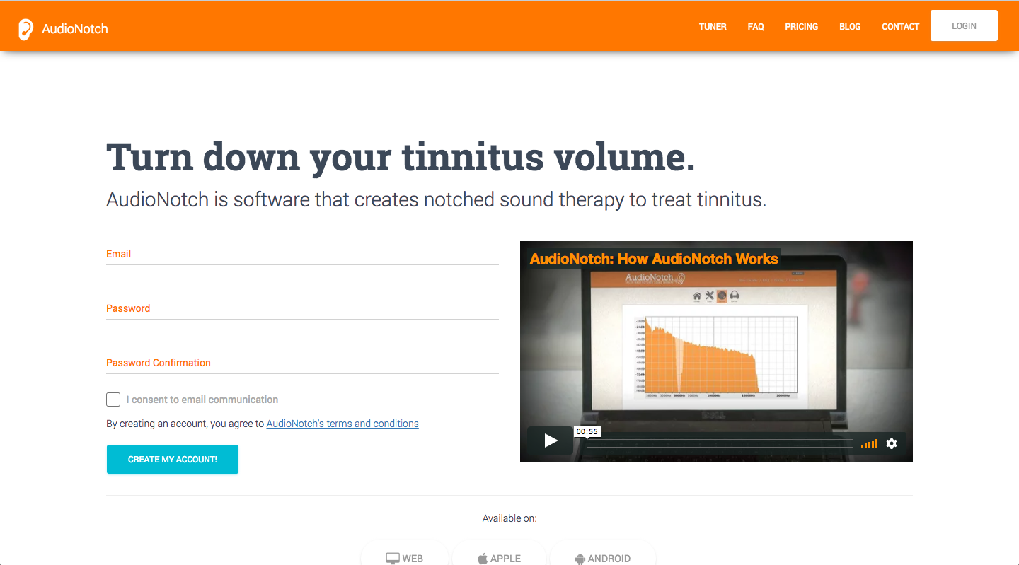
If you notice here, the textual content and functionality of this page is exactly the same as the previous one (minus changing the text on the top). I wanted to keep the same feel of using the app, but making everything look nicer.
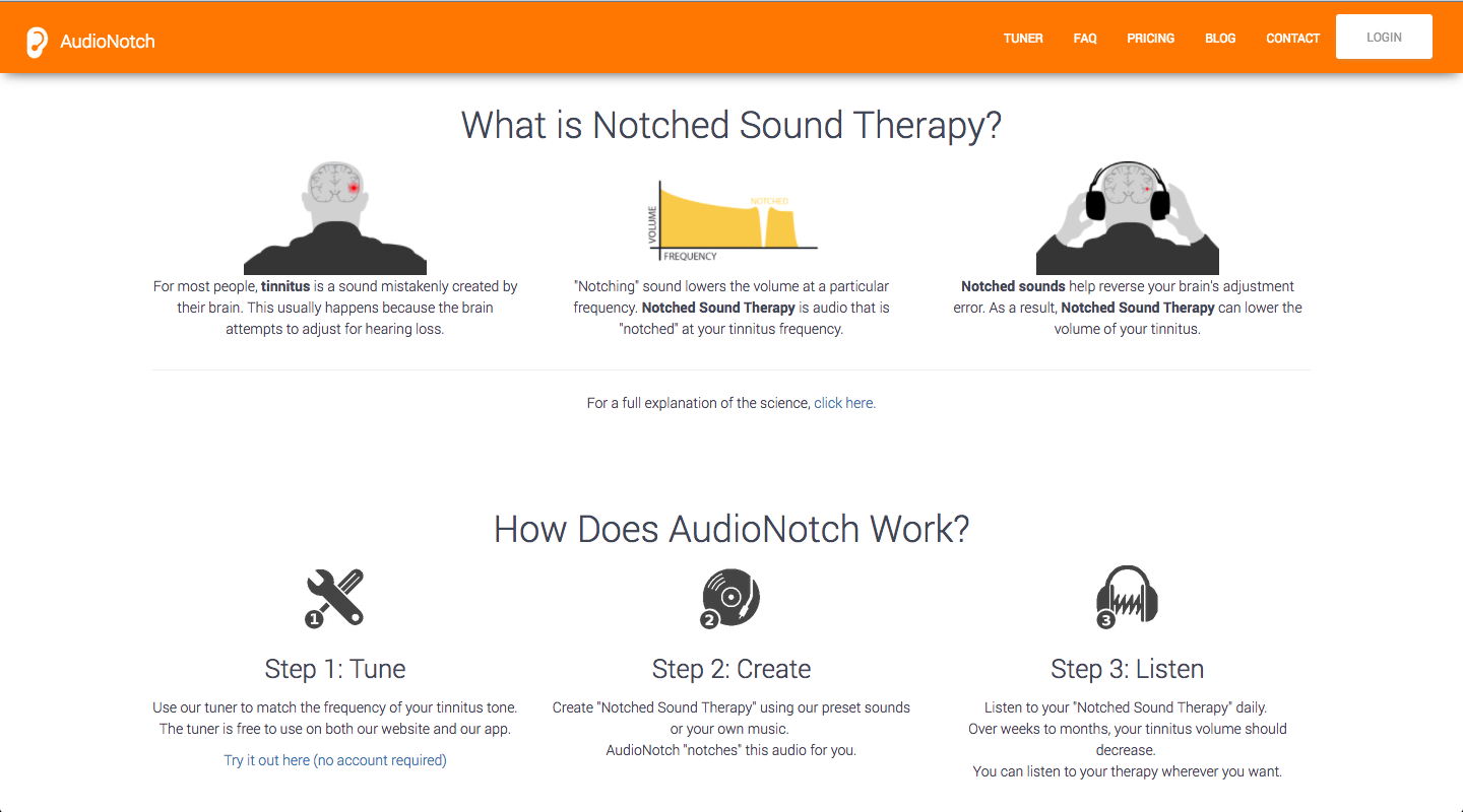
Obviously, some things had to change: the navbar, for example, needed to be consistent. But, when the layout of the previous system worked, I kept it. I think it made the transition to our new site easier for our users, which was a big positive.
Compare the old tuner to the new one, for example:
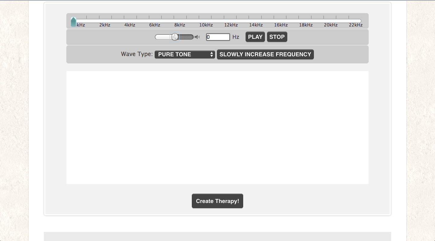
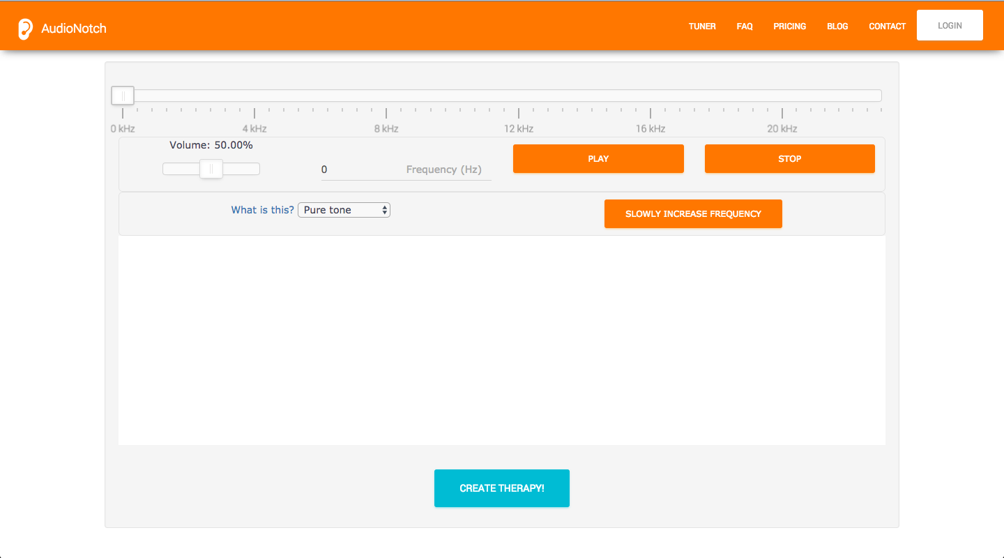
I gave the tuner a breath of fresh air on some of the UI pain points, and I did change some of the alignments/display-type of the elements, but everything is in the same place that it was before. Returning users will notice new button shapes and colours, but the actual tuner works exactly the same as it had before.
I’ll talk about exceptions to this principle, but it’s the idea I used during the entire re-work. I don’t want this to become another Digg.
Mr. Sitewide
I made a few sitewide changes to generally improve readability:
- Mobile responsiveness!!! (I talk about this later too)
- New navbar, which is now only one-level and mobile responsive
- New colour scheme (same idea though), a little more bright and feel good
- Focused layouting (I explain this later)
- Standardized standard content areas (footer, navbar, app drawer, etc.)
- New and larger icons (Font Awesome!)
- Responsive imagery
- Upped font sizes and made almost all fonts relative (this is a Bootstrap thing, but it’s still good that we did it)
- General coding stuff that made my life easier (less inline styling, compressing stylesheets, removing unneeded libraries, etc.)
- Used
asyncanddeferto make stylesheets and JS non-render blocking - Accessibility things! (alt tags, using semantic headers [but only sometimes], using screenreader classes)
Case Study: The Homepage
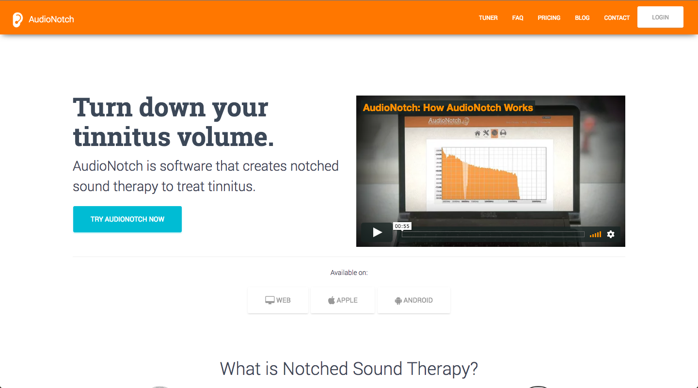
You already saw the old home page, but I want to talk quickly about what I did to the new home page. Quick reminder of old vs. new above the fold:
First, what’s above the fold? Above the fold refers to content that loads when the user immediately visits the website, without scrolling at all. While the exact importance of this kind of content is hotly debated, it’s obviously important to have: we need to make sure that our first impressions are good.
With that in mind, a few thoughts on the changes I made:
- Removed the background image. I thought that it was distracting, and not relevant to our product.
- Made the gutters smaller. We didn’t need that much edge space, and it gave our content more breathing room.
- Moved the hero header to the very top, across the entire “row”. It looked too clumped when squished into half of the page, and it’s the most important part of our pitch (since it explains what our product is).
- Reworded the header to be more active. “Turn Down Your Tinnitus” is significantly more explanatory than “AudioNotch creates…”, and also is more active. Makes the user immediately understand what we do, and makes them feel a part of it.
- Made the video slightly smaller. It isn’t actually the “sell” of our product, though it does help.
- Made the form slightly larger. This is what we want the user to do, to sign up for an account.
- Added contrast to the “CREATE MY ACCOUNT” button. Since this is what we want the user to pay attention to, we make it blue to contrast directly with the rest of our site (white/orange).
I still wasn’t super satisfied with this build, even if it kept the same feel. Here’s a different version:
This is my favourite build. We drop the form completely and focus on a simple “Try AudioNotch Now”, which conveys even more action (that actually goes to our tuner, our free hook). This version is more simple, and something that I’ll emphasize even more, is that simplicity is key.
For the two different home pages, I don’t actually know what’s better. We’re currently in the process of A/B testing the two different home page styles and seeing which converts better: only with that kind of data can we make better decisions.
Then, we’ll go on the next “section” down, or what the user sees after scrolling down from our home page.
A few differences I want to point out:
- I dropped the infographic. It’s hella confusing.
- Changed the content layout to be three columns with the user reading vertically, which is more natural.
- Changed the content.
“Changed the content” isn’t descriptive, so I want to talk about exactly what I did.
Firstly, I changed what we presented. In the old section of the site, the user is jumped right into what our product does, and why you should choose us. For something like a notes app or an email reader, that makes sense: people already know what those kinds of products are, so they want to know why they should buy your product.
Not with notched sound therapy. At the beginning of this blog, I had to take time to explain what tinnitus was, and what notched sound therapy was. They’re important concepts to understand before you can start using AudioNotch. The old landing page assumes that you already know what tinnitus and notched sound therapy are, and doesn’t explain any of the science behind it. This leaves the average user confused. They don’t know if our product is scientifically backed or just voodoo magic, and it’s because we don’t even make a stab at explaining why people need our product. Even the average tinnitus sufferer probably doesn’t know what notching audio does, and their family members most certainly won’t.
The new landing page takes a step back before giving our pitch on AudioNotch. It explains what tinnitus is, and how notched sound therapy is supposed to help tinnitus sufferers. Instead of over-inundating the user with a bunch of app-specific lingo, we go for short, concise sentences that explain why people need to use our product. We don’t make the user think too hard, or rely on a previous knowledgebase: we start from the bottom, and then we go and explain what our product and why it’s super cool.
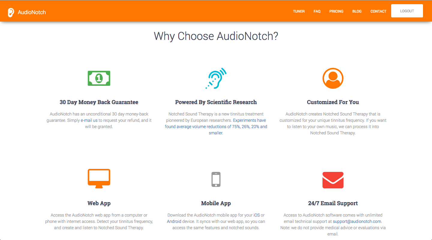
I also focus on icons more. I don’t go for any new, groundbreaking layout design; rather, the opposite of that. Conventions are familiar for users, and it makes things easier for them. They don’t have to think to parse the information from our site, which is important. This new “Why Choose AudioNotch” section shows that. Compared to the old one (in the below the fold section earlier), this one has less text and more icons. The user already knows what that envelope means, or the little phone, or desktop computer. They don’t even need to read the headers, or the resulting lines, to know what we mean. It creates content that users can easily sift through and understand, and doesn’t overwhelm users.
There’s less content spread over more space (though there’s more, but this is already super long), but it’s worth it. Less is more in this scenario, especially when our text is more concise and digestable. The images help the user figure out what we’re trying to say in a different media format, and that in itself is important. Ultimately, the new home page does a better job at explaining what we do and why you should buy our product. It shows: 180% avg. page duration and 2 minutes longer avg. sessions with this new home page. Good, right?
I’ll do more case studies in another post. Coolio?
La Fin, Maybe?
The reason that this is a “part 1” is because my analysis isn’t done yet. We’ve only just started pushing these changes, and there’s a lot of data to collect. The mobile app’s already made some money, and the new website has already pushed conversions up, but I want to see how my changes have held out over months, maybe years, and what kinds of feedback we get. Users are periodically telling us what they think (mostly positive), and we’ll get more and more as time goes on. My plan is to revisit this analysis in 6 months or so, to see how well my work has held up.
I’m very happy that I worked at AudioNotch, and I’ll go more in-depth about the work experience I learned at the company some other time. I hoped that this blog post kind of shed a light into my thought process behind the work that I did, and I’ll be doing even more content like this as the school year continues (though I am super busy).
I want to end off with a simple user testimonial that made me super happy.
Thank you Audio Notch guys! - AudioNotch User
Feels good, right?